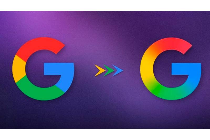
Google unveiled a soft-focus version of the G emblem, which the tech giant initially used in 2015, as part of a covert logo makeover.
According to a source, the Google app on iOS and Android unceremoniously launched the updated look earlier this week.
Google’s new G icon has been released
The new G logo uses a seamless gradient to link Google’s four brand colors, whereas the previous one used solid blocks of red, yellow, green, and blue.
This is the first update to the circular emblem since Google switched to the minimalist sans-serif Product Sans for its wordmark almost ten years ago, replacing the company’s all-blue lowercase g.
The business has not yet disclosed the reasoning behind the revamp or whether its wordmark and other applications, including as Maps and Chrome, will adopt a similar ombre style.
The design, however, has already drawn comparisons to Strohl’s gradient logo for Google’s artificial intelligence (AI) assistant Gemini, which was released in 2024.
“The ever-evolving nature of the AI, embodying its continuous growth and adaptability” is reflected in the colorful gradient, according to the San Francisco design company at the time.
Over the past few years, Google has quickly expanded its AI portfolio in response to the rising demand for chatbots such as OpenAI’s Chat GPT.
The corporation reported a 50% increase in emissions in 2023 as a result of the new technology’s enormous energy demands.
Amazon is one of the other internet businesses that recently changed their logos. Just last week, the company put a “more empathetic smile” beneath its recognizable wordmark.
Topics #First G Logo Redesign #Google #Google's new G icon